
The short answer: the colours leading Australian interiors in 2026 are warm neutrals and warm whites, earthy greens, burnt orange and terracotta-style tones, soft pastels and dusty pinks, and a few deep berry or claret accents. Dulux, Taubmans and Wattyl all moved away from stark white and cool grey in their 2026 forecasts. The smart way to use a trend is to put a warm neutral on the large surfaces and keep bolder colours for walls, doors or joinery that are easy to change later.
If you're planning a repaint, it's natural to wonder which colours are worth choosing. The honest answer is that the best colour depends on your light, your floors and your taste, but it helps to know where the big Australian paint brands see colour heading.
This guide pulls together the 2026 forecasts from Dulux, Taubmans and Wattyl, explains the main colour families you'll see in Australian homes this year, and shows how to use a trend without painting yourself into a corner. A forecast is a guide, not a rule, and the best colour is the one you'll still enjoy in five years.
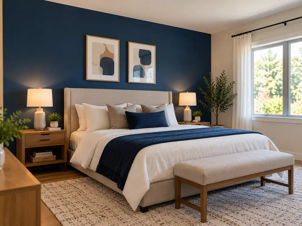
What do the 2026 colour forecasts have in common?
Dulux's 2026 Colour Forecast is built around three palettes, Ethereal, Elemental and Evoke, and it predicts a move away from stark whites and high-contrast palettes in favour of warmth, comfort and harmony. Taubmans' 2026 palette, Down to Earth, is a grounded mix of neutrals, accents and whites. Wattyl's forecast is bolder and sunnier, with burnt oranges, sky blues, rich pinks and jungle greens.
| Brand | 2026 theme | Colours to know |
|---|---|---|
| Dulux | Colour Forecast 2026: Ethereal, Elemental and Evoke | Warm earthy neutrals, sage, moss and spearmint greens, burnt oranges, soft pinks, muted berry tones |
| Taubmans | Down to Earth, with Team Spirit (an earthy green) as Colour of the Year | Neutrals, accents and whites, including Designer White, Birch Forest and Deep Claret |
| Wattyl | A sun-soaked, optimistic forecast | Burnt oranges, sky blues, rich pinks and jungle greens, such as Burnt Clay and Ocean Foam |
Summarised from the Dulux colour trends page, Taubmans' Down to Earth palette and a Style Curator report on Wattyl's forecast. Colour names are the brands' own.
The common thread is warmth. Across the three brands, 2026 is about colours that feel calm and comforting, with nature-inspired tones and fewer cold, stark shades.
The colour families to know in 2026
Warm neutrals and warm whites
Dulux's Elemental palette is a tonal, nature-inspired mix of warm whites, neutrals and soft greys, aimed at calm, structured interiors. Taubmans pairs its earthy colours with Designer White, which it suggests for doors, trims and ceilings to create contrast. Wattyl's Bleached Hemp, a soft sun-bleached stone tone, is described as an easy first step into more colour.
These are the most flexible choices for open-plan living areas, hallways and any room you want to feel calm. They also make a good base that lets you change furniture and accents without repainting.
Earthy greens
Greens feature in all three forecasts. Dulux highlights sage, moss and spearmint, and has pointed to the rising dominance of spearmint green. Taubmans' Colour of the Year, Team Spirit, is an earthy green that Bunnings' guide to the palette suggests for a feature wall, and Birch Forest is a softer green in the same palette. Wattyl leans towards deeper jungle greens.
Earthy greens suit bedrooms, studies and feature walls, where a calm, natural feel is the goal.
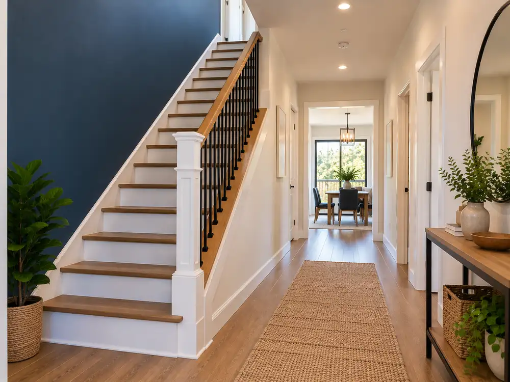
Burnt orange, clay and terracotta tones
Dulux's forecast includes rich burnt oranges and caramels, and Wattyl's Burnt Clay, paired with the soft blue of Ocean Foam, shows how a warm terracotta-style colour can be balanced with something cool. These colours tend to look at home alongside natural timber and work well on a feature wall or in a dining room, where the warmth feels inviting.
Soft pastels and dusty pinks
Dulux's Ethereal palette is a delicate blend of soft and mid-tone hues. Pastel greens, mauves and blush pinks such as Savin, Different Pink and Soft Fresco create a gentle, romantic mood, and the forecast notes that soft earthy pinks pair well with browns and burgundies. These work well in bedrooms and other spaces where you want a softer feel.
Deep berry and claret accents
Dulux's Evoke palette brings in rich tones such as Misty Grape and Germania, layered with deeper hues, and muted berry shades appear across the forecast. Taubmans suggests Deep Claret in a dining area for drama. Deep colours like these are best used in small doses, on a feature wall, joinery or in a room you use mostly in the evening.
Colour and light in Wagga Wagga homes
Natural light changes how every colour looks, and Australian light is strong. A north-facing room gets warm, bright light for much of the day, which can make cool colours look flatter and warm colours look richer. A south-facing room is usually cooler and softer, and can make some colours look darker or greyer than the sample suggested. That's why testing a colour in the actual room matters more than any forecast.
It also helps to think about when you use each space. A bedroom you mostly use at night will be seen under artificial light, while a living area gets daylight for most of the day. Choose with both kinds of light in mind.
Where to use bolder colours
A bold colour is easiest to live with where it's easy to change. A feature wall, a door, built-in joinery, a study or a powder room can take a strong colour without committing the whole house to it. Keep large open spaces, such as living areas and hallways, warm and neutral, and let the bolder colours carry the personality.
How to choose colours that still feel right in five years
- Start with a warm neutral base. It's the most forgiving choice for living areas and gives you room to change accents later.
- Work with what you can't change. Floors, benchtops, tiles and built-in furniture all have undertones, and your paint needs to sit comfortably alongside them.
- Test large samples. Put big swatches on the wall and look at them in the morning, in the afternoon and under your lights at night. Colours can change a lot with the light in a room.
- Keep the boldest colour to one place. One wall, one door or one piece of joinery is plenty.
- Choose the right sheen. The same colour looks different in matt and in satin, and some sheens suit some rooms better than others. Our guide to choosing the right paint sheen explains how.
- Think about changing it later. Strong and dark colours often need primer or extra coats to cover, so a bold choice is a small commitment, not a free one.
Looking ahead to the 2027 forecast
Colour forecasts move on every year, and Dulux has now released its 2027 forecast, with three new palettes called Play, Treasure and Sensory. That doesn't make the 2026 colours dated overnight. Forecasts tend to evolve rather than reset: the Dulux 2026 forecast, for example, was described as building on the colour saturation of 2025. If you love a colour, choose it for the way it works in your home, not for the year it appeared in a forecast.
Frequently asked questions
What is the most popular interior paint colour in Australia in 2026?
There isn't a single winner. Warm neutrals and warm whites, earthy greens and soft pastels feature across the 2026 forecasts from Dulux, Taubmans and Wattyl, and the common thread is warmth rather than stark white or cool grey.
Are grey walls out of fashion?
The 2026 forecasts lean towards warmer neutrals rather than cool, stark shades. If you like grey, choose one with a warm undertone and test it in your own room, because the same grey can look quite different depending on the light.
How do I choose a colour that won't date?
Keep the large surfaces in a warm neutral and put bolder trend colours in places that are easy to change, such as a feature wall, a door or joinery. Pick colours because they suit your light, floors and furniture, not because they're on a forecast.
Should I use a bold colour on a feature wall?
A feature wall is one of the easiest ways to try a stronger colour. Test a large sample first, and remember that deep or strong colours often need primer or an extra coat to cover when you eventually change them.
Does the colour I choose affect the cost of painting?
It can. Going from a dark colour to a light one, or covering a strong colour, usually needs primer or extra coats, which adds labour. Our guide to what interior painting costs in Wagga Wagga explains how coats and preparation affect a quote.
Ready to bring a new colour home?
If you're planning a repaint in Wagga Wagga or the Riverina, we're happy to talk through colours and finishes as part of a free quote. You can read about our interior painting services, see how our painting process works, browse recent interior projects, or request a free quote. If you're budgeting, our guide to what interior painting costs in Wagga Wagga is a good place to start.
Last updated 4 October 2026. Colour trends and brand colour names change from year to year, and colours look different on screen and on the wall, so always test a sample before you commit.